
Professional Development Page


SubjectToClimate is an hub that connects educators of all grade levels and subject areas to the resources they need to teach about climate change.
SubjectToClimate has started their strategy of making their platform more user-friendly while having a strong brand identity and have hired me to be their lead project designer to start off the project.
Role: Product Manager, Product Designer (Design & Research)
Duration: 3 months
Team: Me, UX/UI designer, lead developer
Tools: Figma, FigJam, Notion, Zoom, Google Suite
What is the Problem?
SubjectToClimate recognized that its primary platform, which was the company's MVP (Most viable product) posed challenges for users, leading to confusion due to its lack of user-friendliness and a disjointed user journey. The website exhibited an outdated aesthetic, prompting the realization that a comprehensive upgrade to both the user interface and branding was imperative.
Market & User Research
Competitive Analysis
As the lead product designer on the project, I conducted a competitive analysis to scope out the other education platforms to see what their strengths were and also how we can draw inspirations.
Findings:
-
Every competitor that has resources has clear & concise resource cards that we did not have
-
Brand identity is very strong throughout their whole website
-
Clear navigation tabs with hover features
-
Keeps the user on their site the whole time without navigating to a new page


User Research
Spoke to 4 teachers to talk about their experience with the PD page and specfically what they thought about the cards that show all the information about the opportunity
Findings:
-
The cards share way too much information and it's overwhelming
-
Often times the real important information is not highlighted
-
When it is offered
-
What type of opportunity it is
-
-
The filters are hard to navigate
-
They never know which opportunities are coming up soon
Our Approach
As the lead product designer, I decided to take things page at a time and use an agile approach to our redesign. I wanted to make sure that we start from our Professional Development page so we can learn about our users more and things that we must be aware of before moving onto the future pages.
Our developers also wanted to start the migration process of changing our framework to Vue.js for a more open & flexible approach to writing code in the future of our platform. I've worked closely with our developer to make sure that we have a solid plan moving forward, how the design system will be implemented, and taking our redesigns one page at a time with user research as our backbone to our decisions.
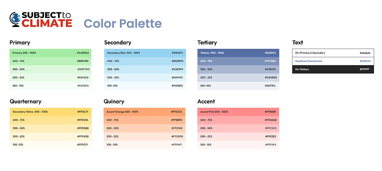
Starting our Design System
Our primary colors represent the earth with land & water and added bright colors to have it be teacher & student friendly


Project #1: Professional Development Page Re-Design
Process
1. User Research Results: Consolidated previously done UX research and made lowfi designs
2. Meetings with the content team to make sure it aligns with their vision for the PD page
3. Meeting with engineers to discuss the feasibility of some of the designs sand new features
4. High fidelity designs + PRD (Product requirement document)
5. Deliverables to the development team
Original Professional Development Page

-
Too much going on with the page
-
Filters are not well organized and users prefer not to use the filters despite the fact that it will help them find what thy are looking for
-
No clear way to indicate any PD opportunities that are happening soon

NEW! Redesigned Professional Development Page + Solutions

-
Featured courses on the top for easy access
-
Card design is simplified with consistent tags rather than multiple lines of information
-
Clear showing of the provider logo


Mobile Version


-
Each of our redesigns required a mobile version as we do have users who prefer using our platform on their phone
-
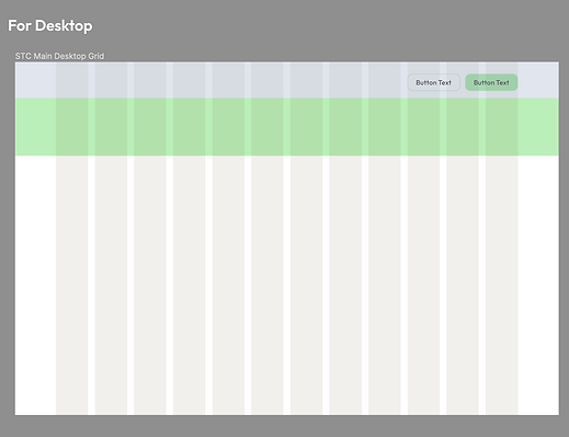
We started with creating clear grids and margins
-
Approached it with clear user journey intentions as well as consistent designs which the previous version lacked.
User Testing
Testing with Teachers
We were able to do a user testing session with some of the teachers who either work internally in our company and with some teachers in my network.
We asked them to:
-
Find a specific PD opportunity using the search bar
-
Find a specific PD opportunity using the filters
-
Look through our new designed page for feedback and anything that stands out to them.
All 4 teachers were able to find the PD opportuntities that they were supposed to find through the search bar & filters
Teachers had confusion about where exactly the selected filters were, didn't know it was on the search bar. Also couldn't find the "Ongoing vs. Upcoming" opportunities
On the details page, teachers expressed that the information was clear & simple but seemed a bit unorganized
Reiterations
We made changes on the filters & the details page after hearing from our users
Filters
Users were having some confusion with the selected filters being on the search bar
They also could not find the Ongoing PD vs. Upcoming PD buttons


PD Details Page
Users said that they really appreciate the information but seemed like for a lot to read, things seemed a bit unorganized and hard to follow


Next Steps

-
Analyzing HotJar results to observe user interactions
-
Top clicks
-
Rage clicks
-
Drop off rates
-
Average time on page
-
U-Turns
-
-
Make future changes based on the interactions that we see
-
Constantly learning, reiterating, and improving the user experience
Company Outcomes
More interaction seen on our Professional Development Page
40% less U-Turns from the Professional Developement page
Conversion rates have increased by 15% as seen from our Marketing Team
Many users being interested in our re-design project